Where Do I Vote - User Feedback June 2017
Introduction
On 29th May 2017, we introduced a feedback form asking a Yes/No question: “Did you find this useful?” and a follow up text question “Can you tell us anything more?”. We only showed the feedback form in situations where we could provide the user with some data. We have implicitly assumed that in cases where we showed the “We don’t have data for your area” page and provided contact details for the user’s council, this was not helpful and didn’t ask for feedback. The way to fix/improve that is to have greater coverage. We also only showed users a feedback form on our own website - it wasn't shown to embedded users and we don't have any data about users consuming our data on third party websites via the API.
From introducing the form until close of polls on 8th June, we served 480,000 unique users on the site and collected 18,394 responses from them. Of the 18,394 responses:
| Found useful | Number | Percent |
|---|---|---|
| Yes | 17,197 | 93.49% |
| No | 1,197 | 6.51% |
| 18,394 |
It is important to understand what people liked and found useful so we can keep doing it, and also why people found it unhelpful and what we can do to improve. To drill down into this, we will examine some text comments in greater detail.
What are we doing well?
We received hundreds of short generally positive comments
Excellent, couldn't want more
Amazing
Use of technology at its best
Helpful and straightforward
Brilliant service
These are lovely and it is nice to get so many of them, but they're not directly actionable.
Many people found the site easy to use and left positive comments about the design/presentation/UX:
Super-easy to use, it took me less than 20 seconds to find out where I should vote.
Amazing accessible website that encourages people to vote by its sheer simplicity
very easy and accessible :)
Very easy to use and understand.
Very clear and well designed website.
Nice ux, page load time was good on mobile and very informative
This is a really clear and well set out website. Easy to navigate and all the information one might need is here. I think it deserves an HCI (Human Computer Interface) award. Well done! JMB
Just very efficient
Good UX, clear design
Another thing that a lot of people picked out to comment on was the focussed nature of the site. Where Do I Vote is a site that sets out to answer a single question and these comments seem to validate that it is useful to keep the scope of the site narrow in this respect:
Easy to use and all the info I wanted on one page!
Simple question, straight answer.
Does what it's meant to with no clutter
Nice clean design that does one thing well
All the information clearly on one page thank you!
This was a very quick and precise answer to my question. Well Done!
What should we improve?
Information Hierarchy
Opening Hours
By far the most common request was that people wanted to know the opening hours:
Would be good to include when it shuts.
Could be better if you have opening times too
Opening times would also be useful
you should inform us about the opening times
does not give time of closing
It should tell the time that the station opens and closes.
Over 50 people left a comment relating to this. We do actually show this information and a few people commented that it should be more obvious:
Would've helped to have the opening hours repeated above the address: "Open from 7am to 10pm"
Would like opening times to be more prominent.
Also a few people left positive comments that they found the opening times useful:
All I really wanted to know was the time polling opened but there is it on the right hand side. Thank you. Directions are perfect too. This is an excellent little tool. Well done.
I actually wanted to check when the polls are open until, but that was clearly stated on the right (and of course I guess the opening times are the same for everyone). So thank you!
just had a mare and realised the times are on here aha x
VERY USEFUL INFORMATION GIVEN RE TIMES AND ID
While the opening hours are at the top of the page in desktop layout, on mobile devices, that information ‘collapses’ and is displayed lower down the page.
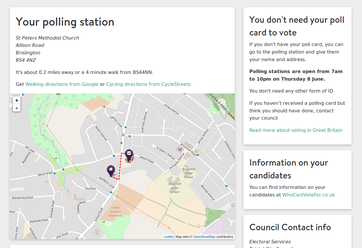
Screenshot of wheredoivote.co.uk in a desktop browser
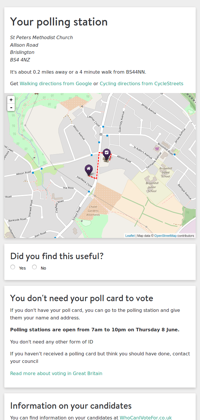
Screenshot of wheredoivote.co.uk in a mobile browser
The vast majority of users on Where Do I Vote were using mobile devices (74% over the study period, rising to 79% on polling day itself). Note that 2 of the people who did find the opening hours useful reference this info being “on the right” (i.e: they were using the desktop layout).
Key points for improvement here are:
- Make the opening times really obvious - this is an important piece of information and people expect it to be prominently displayed.
- Any future design work on Where Do I Vote must adopt a mobile-first approach (rather than a desktop-optimised site that "collapses" on mobile) assuming that the majority of our user base will be using mobile devices.
Information on candidates
A similar issue is that we would have also collapsed the ‘Information on your candidates’ panel on mobile. This would have been even less obvious than the opening times, but only 3 people suggested we add this:
It would have been nice if you listed all the candidates that I could vote for
Who are the candidates in this area
List of candidates and the party they represent please
Again, it is worth making this information more prominent but it should clearly be much lower down in the information hierarchy than opening hours based on these comments.
Voting at your assigned station
A number of people submitted comments which indicate that they didn't understand you have to vote at your assigned station based on your registered address:
Any other options instead of just the one station
Have to search by full postcode not just 1st 3 digits - I want to see ones near work not home
More locations to be shown on map
I want a polling station between station road Cwmbran and Avondale road but don’t know relevant postcodes
There is another polling station closer to me but I was told I couldn't vote there.
I live nearer to David Livingstone school which is being used as a polling station, why can't I vote there?
Do I have to vote only from one polling station?
We currently don’t explain this anywhere, but we should add some copy to the site to make this point more obvious.
Mapping and Directions
We received a lot of feedback about mapping and directions. For a website which is trying to answer the question “where…” this is clearly going to be an important topic.
Feedback on mapping and directions was mixed. Many people who were shown map/directions found it helpful. We received a lot of positive comments about the use of map and directions:
Love the time and distance calculations :)
Very clear directions, well done!!!
I think the map feature is brilliant. Such an easy tool to use.
It is a quick and easy way to locate where your polling station is. The map is very clear and particularly useful
Thank you for the help and the map. SO GOOD!!
Map quality very good and adding the directions was most helpful.
Good to encourage walking and cycling
really useful, and the map is great :)
Additionally, in situations where we were unable to show a map, directions or distance (sometimes we aren't provided with a point and aren't able to geocode it), people commonly requested this info:
no map
Ideally google map
useful but I also needed a map
Maybe a map? But still good!
Would be good if it automatically came up with walking time
A map would help to locate this
No directions, parking information, distance...
A common reason for people to leave negative feedback about mapping/directions was that the directions lines didn't follow the roads exactly (particularly if the roads are curved). In these examples, the maps the comments relate to are shown with the comments to provide context.
This "suggested" route is awful, am I expected to fly or crawl over gardens to get there?
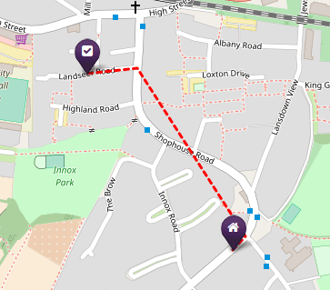
The line doesn't match up with the roads - it's just a straight line between points on the journey. It's better than just a blank map with two points on, but a bit frustrating as it doesn't actually show a route
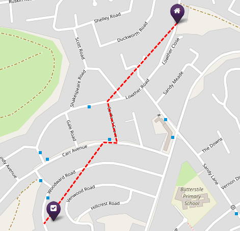
There is something wrong with your maps. The route to the polling station means going through the gardens of several neighbours -- I'm not sure that would be appreciated…
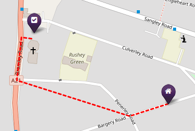
Walking direction is wrong! (You are walking through houses!)
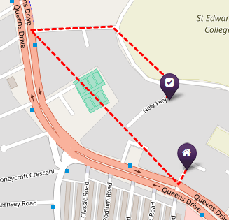
In general, providing directions is useful more frequently than it is not useful but we need to take a more sophisticated approach to the way we represent directions to ensure that the directions provided are of a high quality. We have also run into usage limits with the google directions API which prevented us from being able to serve directions to some users. We should evaluate alternative providers to see if we can find a better solution. It is clear that this is a valuable feature for users.
Another of the most common reasons for people to leave negative feedback about mapping was because the polling station was correct and we were showing a polling station point based on a (correct) postcode centroid but that point we were showing was down the road or round the corner from the actual polling station building.
It helped me confirm where I need to go but the map is slightly incorrect as the entrance to the school is on Regent Road.
Polling station isn't quite in the right place. It's actually in the church 100m east of the marked location.
The pointer is a little misleading. Our polling office is at Mountpleasant Primary School. People would probably find it the end if they didn't know where it was but may have to walk up and down the entire street to spot it.
Wrong end of the street!
when you put your postcode in its telling me my polling station is in someone's house? the polling station is a further 150 yards up the road
The location of the station is wrong. It is about a two minute walk north of there, along Pinner Hill Road, opposite Latimer Gardens. What a terrible piece of information, given the magnitude of the election.
The polling station is NOT in Gloucester Rd but on Brynland Avenue. This is a significant error and may have put people off.
Highly inaccurate! This map shows the Polling Station to be at Skipton Auction Market not the swimming pool. It's a good job that I already know where to go as this load of rubbish would have sent me on a wild goose chase.
This was quite a common cause of negative comments and we did update the site with more accurate grid references throughout the day in many cases where we received complaints. People clearly want maps when we don't provide them but also expect a higher level of accuracy than we can sometimes realistically achieve with the supplied data. There is scope to deliver additional value here by exploring whether we can crowdsource more accurate points in cases where we do not have exact grid references or UPRNs.
Key themes for map and directions are:
- Users want maps and directions and find these useful when provided. If they aren’t provided, we receive negative feedback
- Users expect the map and directions to be precise and of a high quality - if this isn’t the case (for whatever reason), people leave negative comments
For a product which answers the question “where…” this is not surprising. We should look to make improvements in this area:
- Investigate how we can represent curved routes in a more sophisticated way. If we are unable to arrive at a better solution, add some text to acknowledge the issue and manage user expectations e.g: “Approximate route (click for more accurate directions from Google)”
- Investigate other solutions for a directions API - can we find an alternative to google directions which does not have the same usage restrictions?
- Aim to develop tools allowing us to crowdsource more accurate station points where we do not have exact grid references or UPRNs. Is there scope for us to work with or learn from existing online mapping volunteers (e.g. the OpenStreetMap community) on this?
Bug Reports
Another strong theme of negative comments was people using the form to report problems or incorrect information. This is the worst and most worrying class of negative comment.
That's wrong - I got there and the building is closed, no signage re it being a polling station. Correct place seems to be Bute Town Community Centre, about a mile away. Now run out of time to vote before work.
The map sends you to West Bletchley, 30min walk away. Chepstow Community Centre is less than 5 mins walk away.
The pin on the map doesn't match the address.
Wrong polling station
Our voting station was changed due to the hall not being available. You are feeding the wrong information to people.
the map location shown was incorrect, by quite a long way. SM5 4NP is not on Wrythe Lane as shown but on Nightingale Road, the other side of both Carshalton and Carshalton Beeches stations.
This is not where I have to vote. I went and they said nope not here
No community hall at this address. Unable to vote because of this
It is difficult to generalise about these comments because each comment addresses a very specific problem and required its own individual follow-up and solution. Given the volume of data we are dealing with (and the speed with which we have to collate it) it is unrealistic to achieve a 0% error rate but we do need robust procedures to prevent and follow up errors. It is more useful to talk about improvements we can make to reduce errors and improve the process of following up on them rather than address the specific nature of individual reported problems here.
- As noted, we received a large number of error reports through the medium of people leaving negative feedback. One fairly time-consuming part of the process was sorting through a large volume of text comments to find bug reports. We should add a dedicated "report a problem" button to reduce that triage overhead. This form should also request an email address for follow-up.
- Although with 2 people working on it all day we were able to deal with a lot of problems, there was more than 2 people's worth of work to do. For the council election next year, 2 may be sufficient. For the next General Election we should try to allocate additional capacity to this task. Given this is a time-bound and well-defined task, we may be able to find a volunteer to help with this.
- We need to put more effort into making sure we have direct contacts at councils on polling day so we can follow up problems more easily. In particular, there are a number of authorities where we use published data but have no contacts and this was a problem.
- Although our data checking processes are fairly robust, there is scope to reduce our error rate by implementing more automated checks on the data at import time.
Why do people use Where Do I Vote?
One of the most common reasons people stated for finding the site helpful was that they had lost their polling card or hadn't received one:
I wasn't sent a poll card
I didn't receive a polling card, so this was invaluable.
Great for people without polling card
Great tool to use for those who are hopeless with bits of paper through their door
I misplaced my poll card so this was extremely useful.
Haven't received my polling card from council. Useful resource.
Another common reason people gave for finding the site useful was that they had recently moved or were new to the area:
Couldn't be clearer! Very helpful for a first-time voter in this constituency (have just moved here).
Just moved here, didn't know
New to the area. Wasn't sure where it was
new to area ... 1st time voting here ... so thanks.
I'm new to the area so this feature is heavily useful, it's also about 5 minutes walk away which is fantastic!
.. or both:
I recently moved house and didn’t get a polling card hence i had to search
Great tool. New to the area and lost my polling card so didn’t know where to go.
Thanks, I lost my poll card and couldn't remember the address as I only moved last year.
A number of people without polling cards also left comments saying that they had found the additional info (e.g: that they didn't need their polling card) helpful:
Gave me the information I needed right away with a map. And also had helpful related info on the site, including answering a question I had because my polling card hasn't arrived yet.
Very simple to use and the extra information about whether one needs ID or polling card is helpful.
quick and easy, straight from google and confirmed that I didn't need the poll card. Thank you.
I didn't know you don't need your polling card to vote!
Did not receive polling cards - so needed to check where to vote and if you needed the card
I was worried I won’t be able to vote without a poll card. But it’s good to know that I don't need it to register my vote!
There was also evidence that the site was useful for people who had never voted before:
Helpful for young, first-time voter
MY FIRST VOTE TO MAKE A BETTER COUNTRY FOR MY CHILDREN TO LIVE
Thank you, this site is so helpful and clear, it so easy and informative especially for a first timer!
it is the first time I will be voting and I was lost how to do it but now I know thanks to you
Another theme from the comments was that some people had come to the site after trying to find this info from other places (e.g: their local council website):
lovely quick and easy better than local council one!
no other site provided this info for Potton! so thank you!
I don't understand how all the other websites were difficult to navigate to get this info, but thank you for making this simple here.
Quick easier service than phoning the council. Would been nicer to be aware of this before. moving with the times. Things like this need to be the first thing to go to rather than call in.
My local council does not recognize my postcode. This has saved my vote!!!
Better than the council info
Bristol council site not working
Additionally, we can infer that the user interaction with Where Do I Vote is a very quick immediate interaction:
- The information most important to users relates to the practicalities of voting (e.g: opening hours, do I need my poll card). A much smaller number of people commented that they want information on their candidates (which would imply more considered research is taking place).
- The majority of our users were using mobile devices (74% over the study period, rising to 79% on polling day itself). Many people may be using the site while ‘on the move’.
- Where Do I Vote gets the vast majority of all traffic on polling day and the night before.
- The average session duration is just 53 seconds.
Comments like
just had a mare and realised the times are on here aha x
Having walked to the place where I have previously voted - only to find it shut - I felt somewhat at a loss as to where to go. Until I accessed this site.
indicate that some users turn to the site in a moment of panic, while comments like
Simple question, straight answer.
This was a very quick and precise answer to my question. Well Done!
underline that users expect their interaction with the site to be rapid and focussed.
...and finally
In reading through the feedback comments, there were a few nice ‘human interest’ type stories which are nice to end with:
Trying to blag a mate into voting, bribing him and all kinds. He had no idea his was just 0.2 mile away. Thanks for this site :)
Wouldn't of been able to vote otherwise thankyou! Xxx
I suffer from Vascular Dementia and lost my polling card although I am registered I have forgotten the details. This information has been invaluable. Thank-you so much.
Having walked to the place where I have previously voted - only to find it shut - I felt somewhat at a loss as to where to go. Until I accessed this site.
Very clear, simple, comprehensive. It's a wonderful voting tool and it definitely influenced positively my decision to vote. Thank you for providing such informative and easy-to-follow pre-voting platform.